How to achieve a good user experience

November has arrived and with it two of the most anticipated dates for traders: Black Friday and Cyber Monday. Although these dates were not originally from Spain, they soon caught on with local businesses that did not want to miss the opportunity to increase their sales. Before the appearance of the internet and e-commerce, customers had to travel to the establishment and even queue up early to get the best discounts. A lot of people still do this, but thanks to online shops, it is fast being relegated to the past. Now discounts are just a click away and you don't need to physically go to the shop. The ease and convenience of online shopping offer many advantages to consumers, but traders face a number of risks, as a poorly adapted platform could result in lost sales. Today we will talk about how to shorten the digital customer journey to create a good user experience.
What is the customer journey?
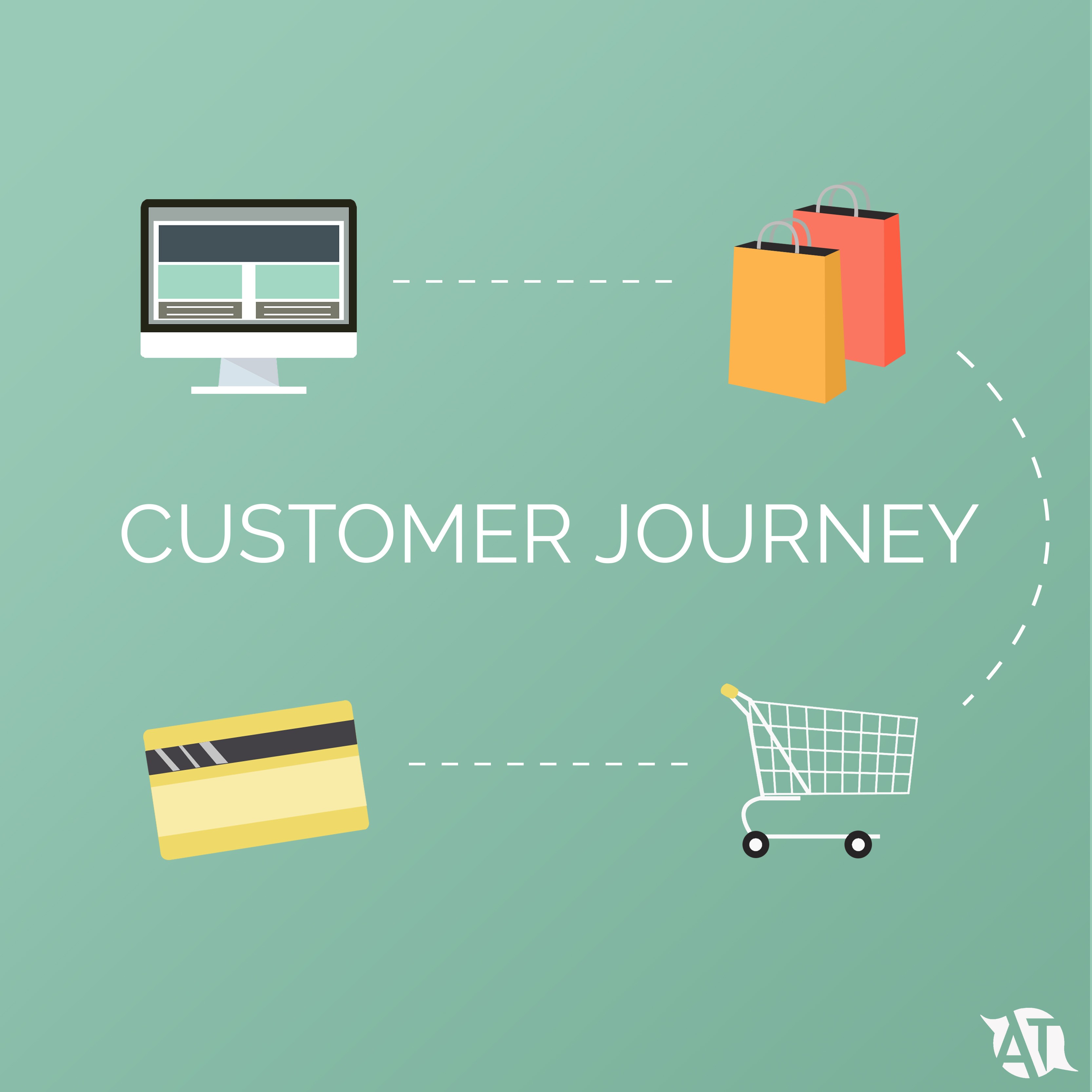
Although the term it is not widely known among internet users, it is an aspect they are well aware of. The customer journey is the digital route taken by the user between the moment they log on to a website to buy a product and the actual purchase. This process can either be quick or lengthy, depending on the steps you have to take. The fewer steps involved in the shopping experience, the more efficient and satisfactory it will be for the customer.
Steps to be taken in the customer journey
The first thing to consider in the customer journey is how many clicks the consumer will have to make to purchase a product. To do this, we need to carry out a customer behaviour study and draw up a map of the steps they have to take once they are on the website.
The aim of any business is for the customer to behave as follows:
- Log on to the website.
- Choose the product they want to purchase.
- Make the payment.
To understand their behaviour, the following aspects must be considered:
- whether the website design is attractive and the elements are well positioned
- whether the products are on display or have to be found on a drop-down menu
- whether it is easy to access the product and add it to the shopping cart
- whether the website is translated into several languages
- how many pages need to be gone through to make the final payment
How to shorten the customer journey
Once customer journey map has been drawn up, it is easier to observe whether there are any steps that can be done away with. If there are, they should be removed. Because, as we mentioned before, the fewer clicks the customer has to make, the faster they'll make the transaction.
Some of the actions that can be taken to shorten the customer journey are:
- Creating an easy-to-use design: Is the website design easy to use? If the customer can easily find what they are looking for on the homepage, the answer is yes. However, if they have to access several pages, you run the risk of them getting tired of the process and giving up. It is important that everything you want to highlight in your business can be found on the homepage and is visible and easily accessible to the user. You also need to bear in mind that many users may access your e-commerce site through other devices, so your website must be suitably responsive so that anyone entering with any device will be easily able to find what they are looking for.
- Translate your e-commerce site into several languages: having an online presence means that any user can see your products from anywhere in the world. To ensure that customers who are not from your country can find what they are looking for with a single click, you need to have the website translated into several languages. By doing this, the customer simply has to log on to the website and click on their language to be able to view all the content in their own language without having to change each time they go to a different page.
- Place the payment methods all in one place: When a consumer has reached this point, you might think the sale is already guaranteed; However, a good number of them might leave the site due to the number of windows they have to go through to be able to pay. If you want to keep the number of clicks to a minimum, it is best to have all the information needed to carry out the transaction, such as card details or the shipping address, on the same page, meaning the customer only has to accept and process the payment.
With the above points put into practice, the number of customer clicks will be reduced and the sale will take place more quickly and efficiently, resulting in more sales and more income for the business.
At AT we are experts in translating websites and we work with all the e-commerce sites (Prestashop, Shopify, OpenCart, etc.). If you wish to localize your online shop, don't hesitate to contact us.


